
Power Couples Education, a couples counseling practice came to me with the hopes of creating a brand that not only stood out from the crowd, but also carried the themes and messages within the foundation beliefs of couples counseling and therapy. This meant trying to incorporate themes such as “twin flames” and “growing together,” in similar fashion to some of the existing logos that exist, combining elements in a clean and effective way. Below is my logo trials and exploration, finally progressing into the final stage with color variations and examples of the branding elements in practical usage for marketing.
LOGO RESEARCH
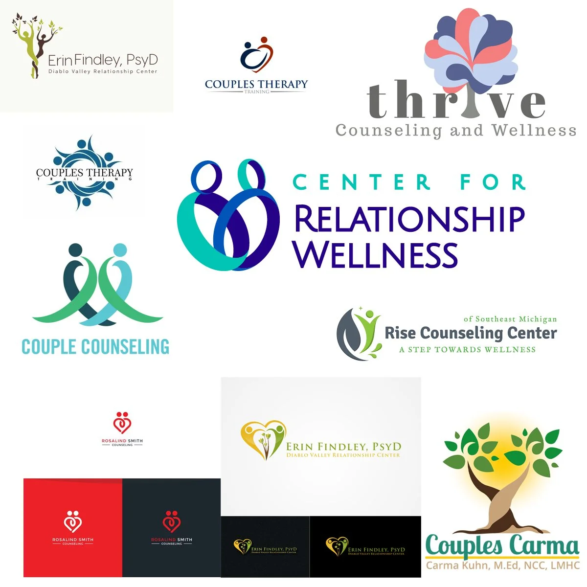
LOGO EXPLORATION
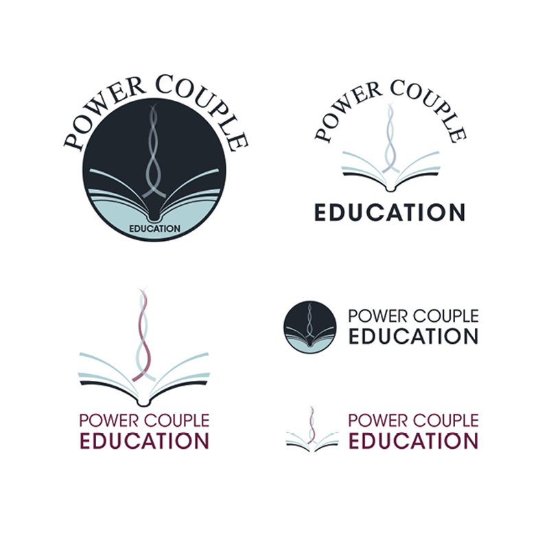
Logo Exploration 1

Logo Exploration 2

Logo Exploration 3
Logo Exploration 4
Logo Exploration 5

Logo Exploration 6
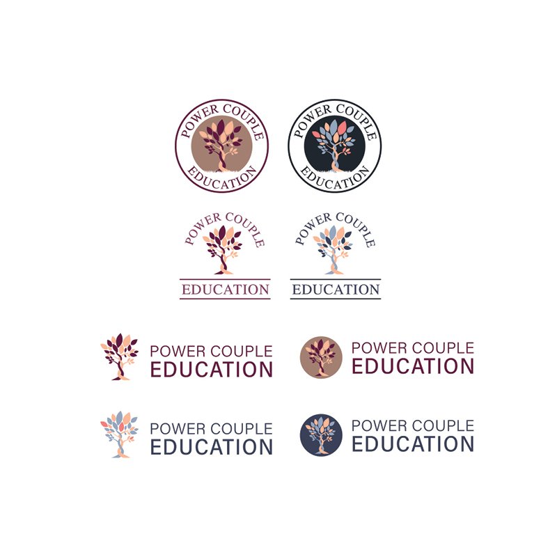
LOGO REFINED
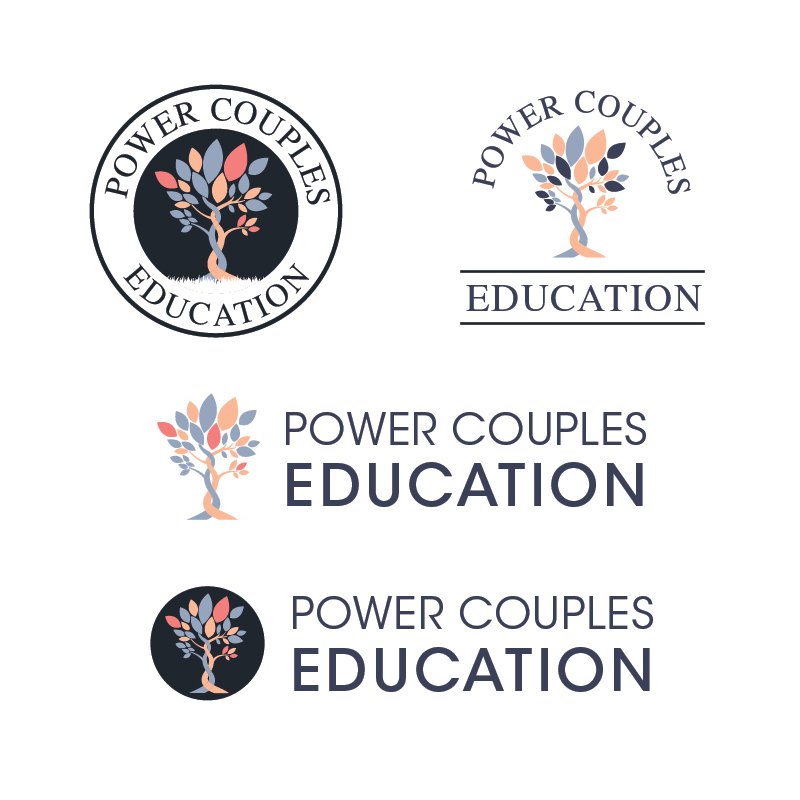
LOGO FINALIZED
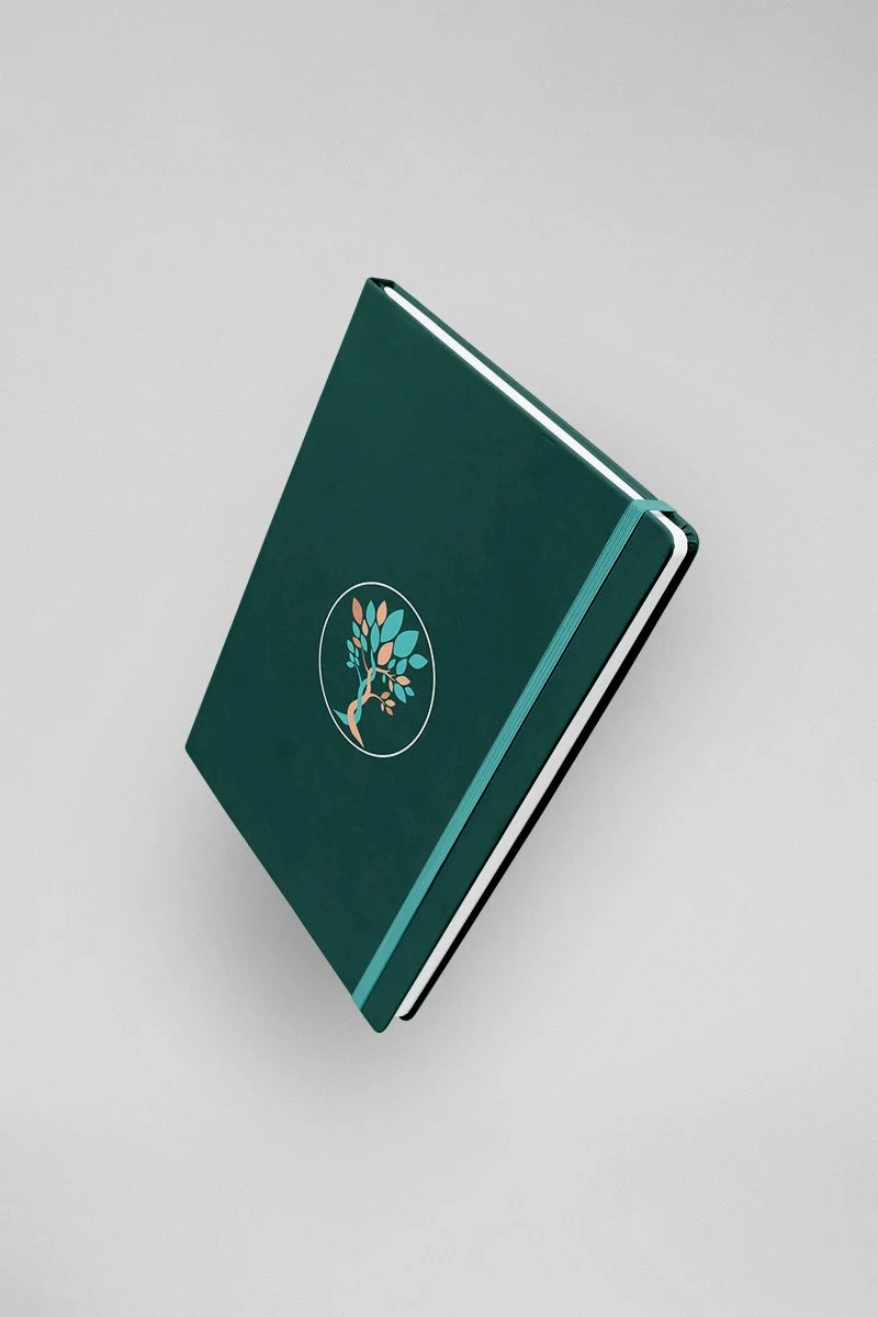
POWER COUPLES EDUCATION Logo
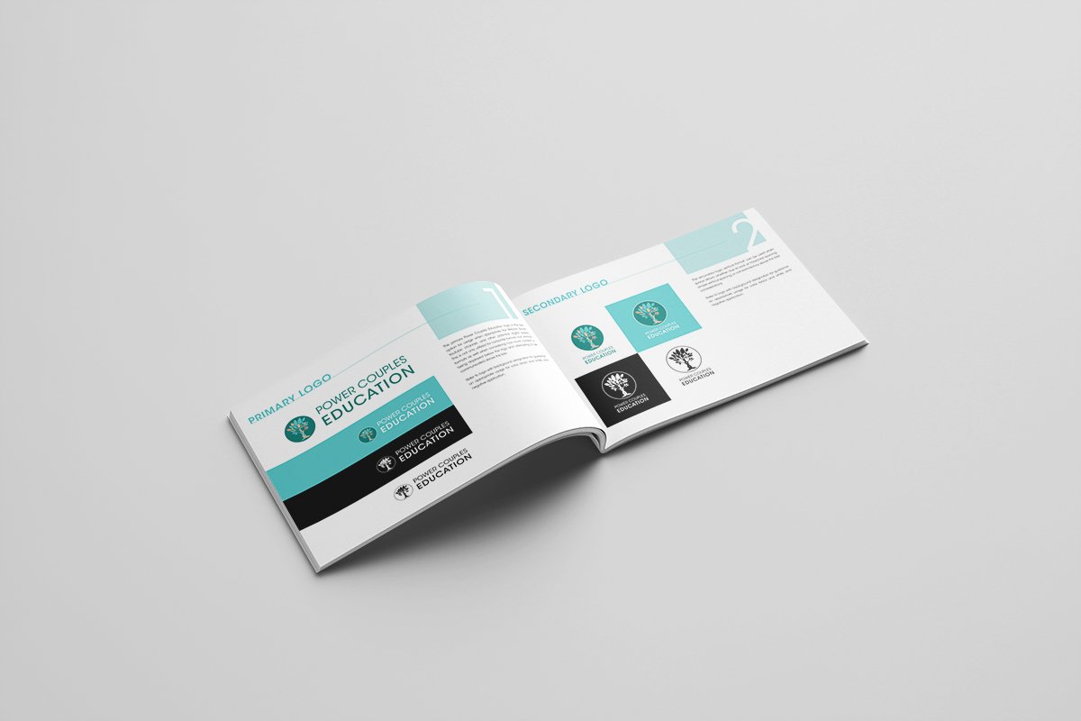
The Power Couples Education logo that was decided on was the interwoven tree, with two sides growing and weaving into one another, with leaves representing the personalities and habits of each partner impacting the other. The primary colors are gender neutral, while still offering contrast for a variety of uses.
BRAND GUIDELINES
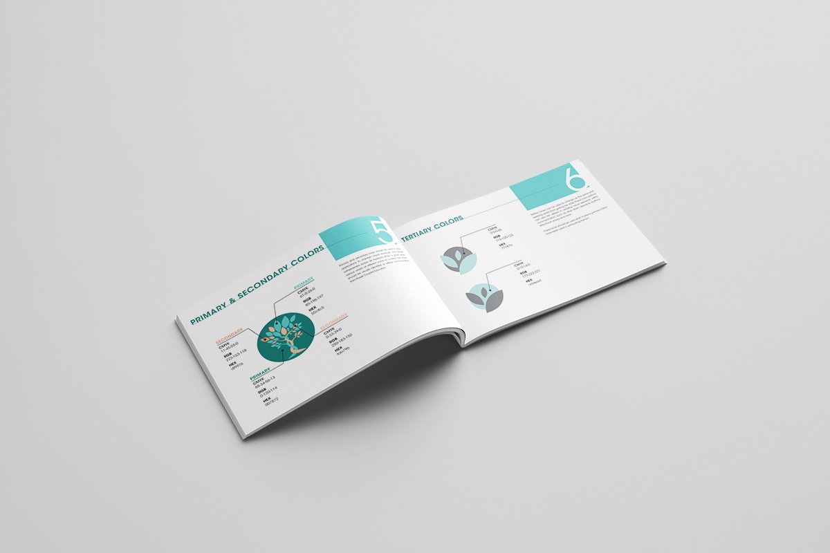
PCE Brand guidelines were created to help strategize the usage of colors, fonts, and elements throughout promotional campaigns and varying usage to help maintain brand consistency moving forward.

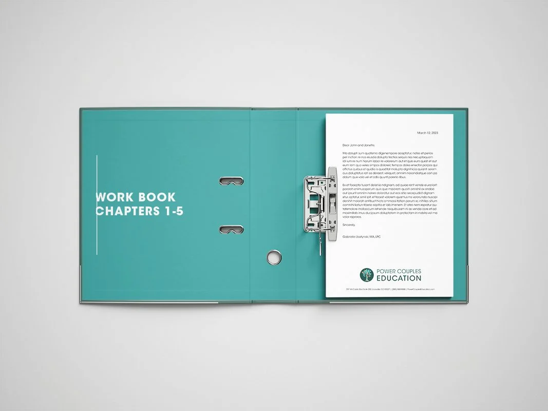
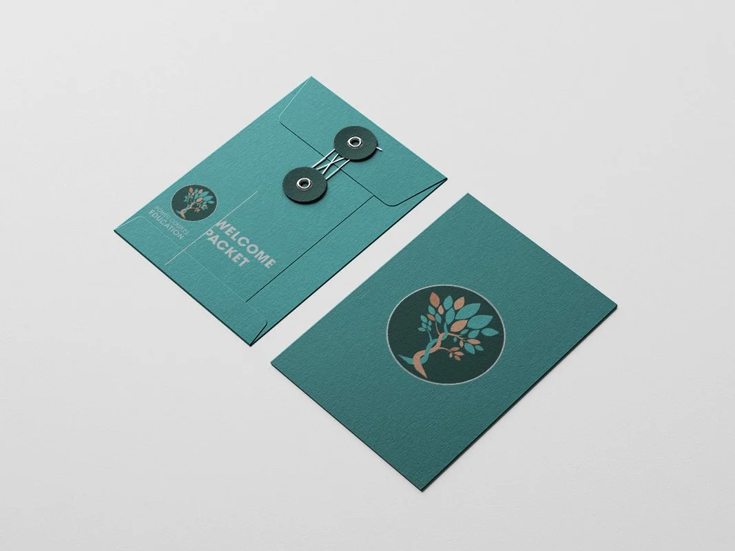
Below are examples of brand elements utilized into practical mock up scenarios for creating social media posts, Youtube channel implementation, and email marketing campaigns.
BRAND IN USAGE

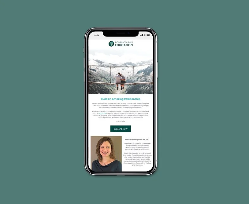
PCE email
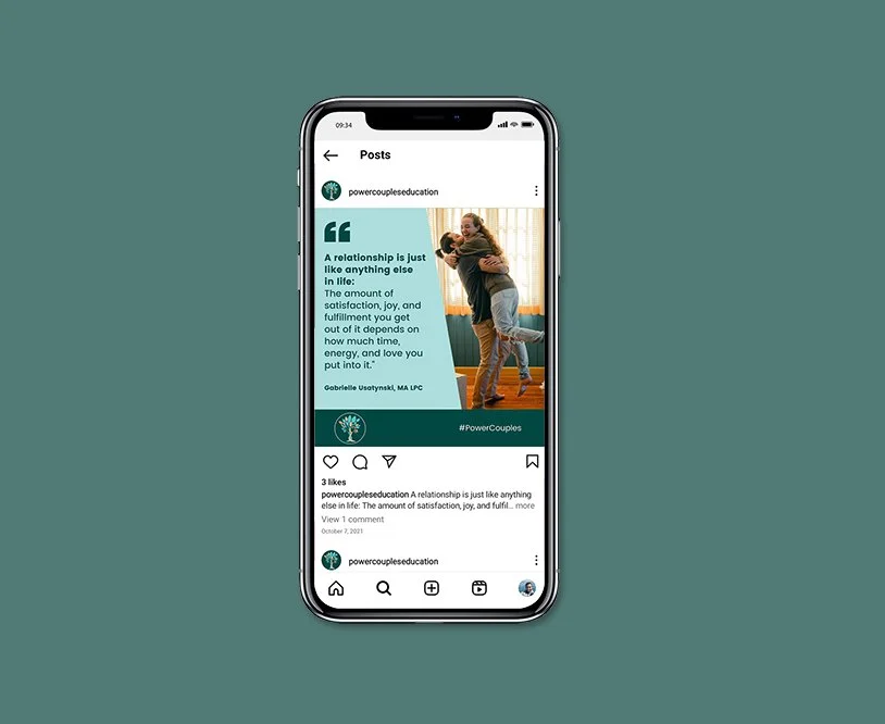
PCE social media

PCE Youtube channel